Professional Free Colour Palette
Generate colors and customize component text
Modern Cards


Interactive Elements
How to Create the Perfect Colour Palette for Your Website
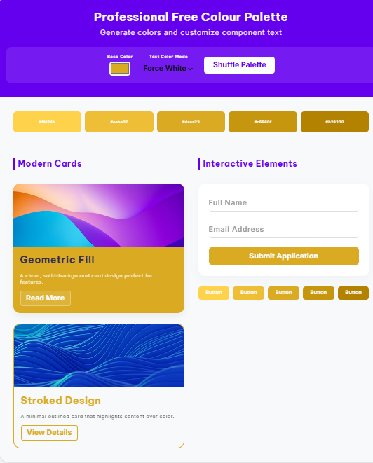
Choosing a colour is one of the most critical steps in web design. It dictates the mood, accessibility, and brand identity of your project. Our professional-grade generator doesn’t just give you a list of HEX codes; it allows you to see your colour in action on real-world UI components like buttons, cards, and animated forms.
Why Visualizing Your Colour Palette is Essential
A common mistake designers make is picking a colour that looks great in a circle but fails in a functional layout. By using our tool, you can check:
- Text Contrast: Ensure your text is readable against your primary and secondary colours.
- Component Harmony: See how your colour behaves when applied to “Fill” vs. “Outline” designs.
- Interactive Feel: Test how your chosen shades look on hover states and focused input fields.
Understanding Colour Psychology in Your Palette
When building your colour scheme, consider the emotions each shade triggers:
- Blue/Purple (#6500ef): Trust, intelligence, and luxury.
- Red: Energy, urgency, and passion.
- Green: Growth, health, and stability.
Tips for a High-Converting Colour Palette
- The 60-30-10 Rule: Use your primary colour for 60% of the space, a secondary for 30%, and an accent colour for 10%.
- Check for Accessibility: Use our “Auto-Contrast” feature to ensure your text meets WCAG standards for readability.
- Keep it Minimal: A great colour palette usually consists of 3 to 5 cohesive shades.